“Le design occupe l’espace” (design occupies space) recently headlined an article in France’s Le Monde. But more than that, one would agree that a great space is also occupied by the elements of colour, style and furniture.
With design, they work like a quartet, and enable the oft-challenging move away from cacophony to harmony in a desired space.
How do they do that?
I spoke to five experts — aka SPACE-MAKERS — who helped me navigate through the elements and demystify the space-making process:
STYLE, STYLE BABY
I met Annie Horth and Nathalie Bouchard at their home at Habitat 67. It is unsurprising that they live there. The Moshe Safdie-designed housing complex is Montreal’s most recognizable living quarters and arguably, one of its most stylish. Horth is a éminence grise of fashion known to many as a stylist, notably credited for crafting and turning around Céline Dion’s style. Today, she focuses most of her big talent on the creative direction of brands, and yes, spaces.
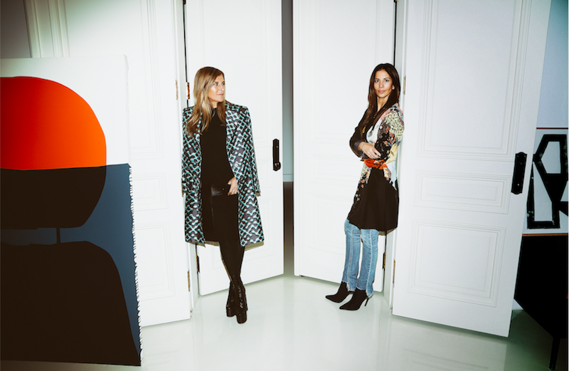
Nathalie Bouchard has a flair for real estate with great potential.
Together with Horth, she founded Creative Flats 20 years ago.
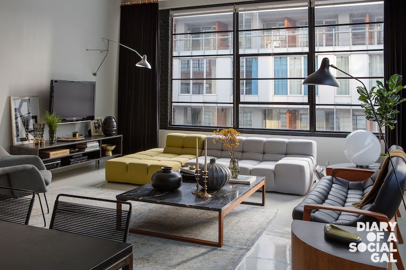
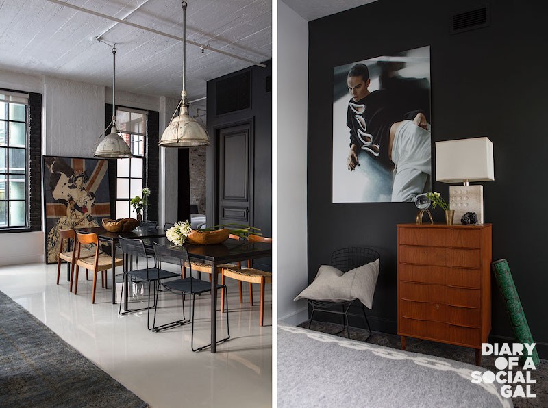
Back then, the idea of catering to a niche clientele looking to rent high-end furnished spaces was innovative and rare.
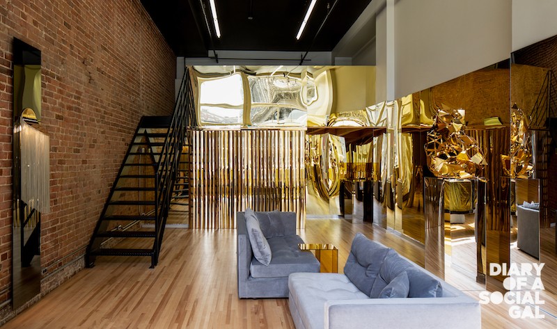
Two decades later, Creative Flats’ impeccably-curated portfolio is still very much in demand, with listings in Montreal and the Eastern Townships still appealing to the sensibilities of many, including Montreal-made furniture and accessory brand Élément de base, who recently held a successful pop-up in one of their commercial spaces.
TRAVEL INSPIRATION
“You both travel often,” I began, inquiring about the destinations that had most inspired their creative journey. “Italy!” they replied in unison, “specifically, Milan and Florence, their favourite cities, where spectacular architecture and authenticity abound.
“There’s a stylistic effort in everything there,” enthused Horth. “From street kiosques to cafés, I love how they use stone, in particular,” added Bouchard. (To that end, it’s no surprise the pair named Amangiri, a luxury resort in the Utah desert resembling a type of fortress crafted entirely from beige stone, as a preferred space.)
CLASSICS IN NEUTRALS
Along with stone, Horth and Bouchard generally stick to natural substances in neutral palettes when establishing a space, a style they habitually embrace in their home and work environments.
Colour is not forgotten though, underscored Bouchard, who explained that incorporating it via accents and works of art is another go-to for them.
ALL IN THE MIX
While clean and pure lines, like those that inform the Modernist era, are a perennial source of fascination (citing Ludwig Mies van der Rohe’s Westmount Square as one of their favourite architectural gems in the city and icons like Prouvé, Mouille, Jeanneret, Eames and Saarinen as major inspirations), they’re also stirred by unexpected mixes and combinations, loving the genius of mix masters like furnishings designer Kelly Wearstler; the sensations behind New York’s Le Coucou and La Mercerie, Roman and Williams; Studio 54 visionary Ian Schrager; and Montreal’s own, architect Luc Laporte, responsible for such Montreal staples as L’Express and Leméac, and the much missed Lux.
Ultimately, for Bouchard and Horth, it is the ensemble that matters, not just design. The feel, the smells, service, the timelessness, constancy and authenticity. All that, according to them, creates beauty and harmony in a space.
BEAUTY WHERE YOU DON’T EXPECT IT
We’ve come to expect beauty from the places we lodge in, where we break bread. A sure sign of collective refinement is that we’ve also come to expect beauty and design from the places we spend time and money in.
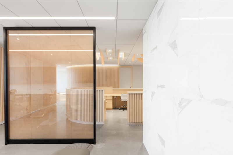
In 2018, the Go Orthodontistes Clinic in Brossard won three Grand Prix du Design Awards.
Having spent years at monthly appointments in an orthodontist’s office, it seemed almost fictional to me that one could walk away with top design honours and that beauty and impeccable design might co-exist effortlessly with ortho-necessary apparatus.
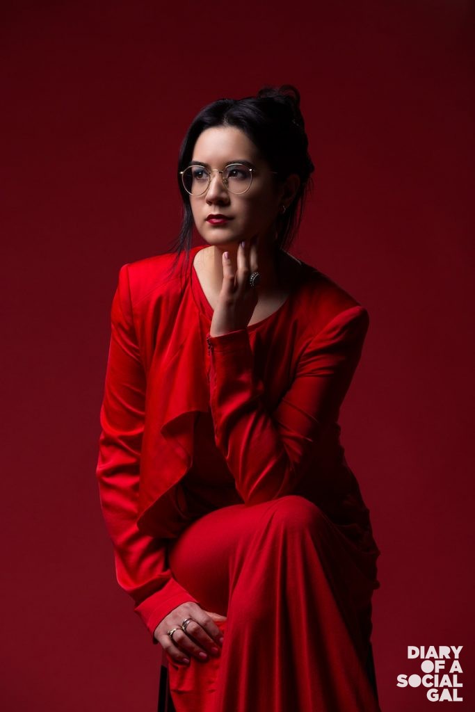
Yet it can. And we owe this improbable equation to multidisciplinary designer, Natasha Thorpe, who was most helpful in my continued quest to understand how elements come together to create arresting spaces:
MUTIPLE SOURCES OF INSPIRATION
While Thorpe certainly sees the magic in striking historic architecture — and, at times, derives unexpected inspiration from myriad sources including music, museums, walks in nature and more, she is most inspired by growth and development, the establishment of fresh feats of design and architecture that seem to appear from nothing. “In a city like Dubai, one gets the sense that the gleaming towers and impossibly immaculate constructions have literally risen out of the sand and sea,” she says with wonder. “Awe-inspiring and limitless, they look to the future.”
That said, her most profound inspiration for award-winning spaces like the clinic is the evolution of a space that is as aesthetically compelling as it is functional and user-friendly, or “user-centric,” as she calls it.
Boasting an open and spacious layout with pleasing curved surfaces, Thorpe’s design of the clinic works well for both on-the-go staff members and visitors who are instantly put at ease by the modern accessible ambiance, a welcome departure from the more formal and desolate medical environments of years past.
NATURALLY BETTER
When it comes to evolving her best spaces, Thorpe, like Bouchard and Horth, is drawn to the integration of raw, natural materials, many of which she used in the clinic. “I like to work with natural materials largely for their tactile impact, “she stressed. “Being natural beings ourselves, there is a certain connectivity between humans and these materials.”
Also essential for her space-making: the enduring nature of … nature, which, along with her fierce fidelity to a good user experience ties in to her hopes for the future of design: “My hope is that eventually design will distance itself from a quick output, trend-focused approach toward practices that are made considering context.” “In our rapidly shifting climate of uncertainty, sustainability and permanence should be considered,” she continued. “That’s not to say design can’t be fun and exciting. However, in my opinion, it should not be disposable and become obsolete.”
PURPOSE IN THE WORLD OF REPURPOSING
For those who have yet to have the pleasure, not your everyday furnishings emporium Artemano is a treat, especially if repurposing high quality wood sourced from Southeast Asia into gorgeous new works of furnishing is your thing.
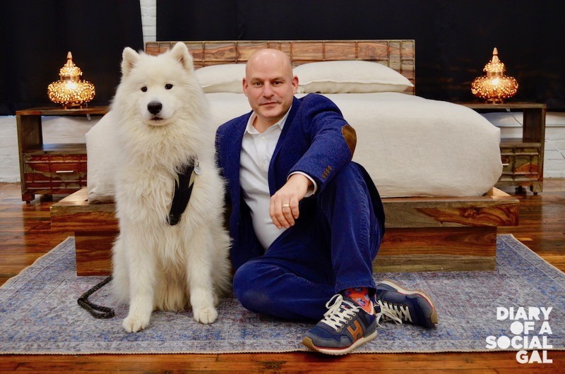
Also a treat: its innovative and inspiring co-founder Eyal Shoam, who proved inordinately helpful in the advancement of my research on the space-making front.
WHERE TO START
Of course, I had to ask a co-founder of a furnishing business to weigh in on the most important investments in a space, the anchors, if you will. He quickly replied that to him, they were the bed and dining table. “This is what we really need on a daily basis,” he said.
Admittedly, things became a little more complicated when he began to elaborate on the overall feel and direction of a space, which he emphasized should “reflect the mood, character, vibe and personality of the people who will inhabit it, and to which all the other items will be linked.”
How to establish that overarching guiding vibe/ feel? He suggested some usual suspects like magazines, showrooms and digital décor playgrounds like Pinterest.
IMPRESSION-MAKING
Next, I had to tap into some of Shoam’s invaluable views on what ultimately defines a space and makes for memorable design.
Regarding the former, he echoed the views of legendary George Braque. “I believe that what defines a space is in the secret dialogue between the items in the room,” he said, talking up the hard-to-articulate magic that occurs when the universe of design aligns and objects connect with each other in powerful always.
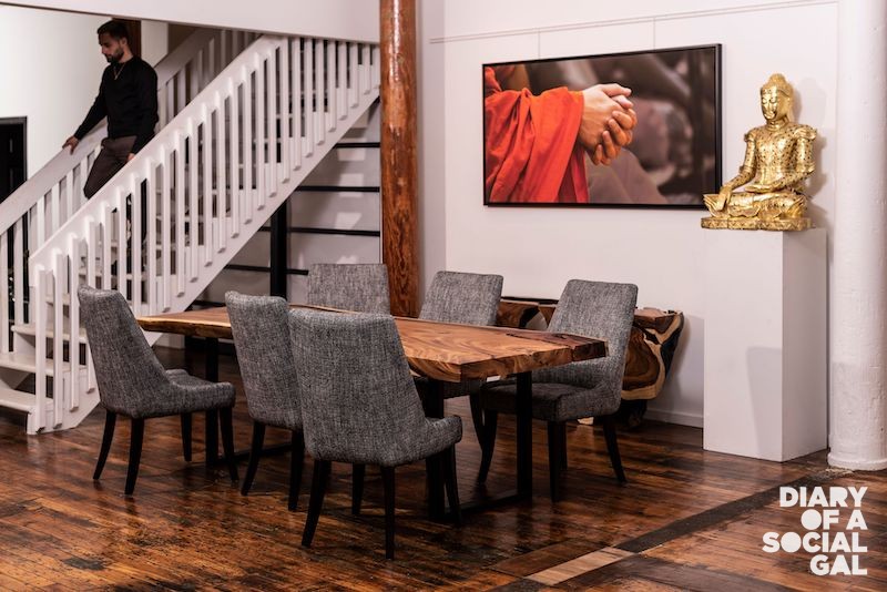
As for unforgettable design, proof of the same lies in its very unforgettableness, a subtle one at that. “The success of a good design is to unconsciously leave hidden memories; nothing loud or aggressive, but ones that can find a way to your heart. I define it as aesthetics,” he went on. “Aesthetics is not a concept just to be used in a professional context — architecture, interior design, fashion, and so on; it is a concept that expresses the visual and physical pleasures that a person can take in from the contact with his environment — clothing, bedding, rugs, glass, flowers.”
Shoam may be a furnishings entrepreneur by day, but he is clearly an insightful teacher as well …
SETTING THE MOOD WITH COLOUR
While the experts thus far have periodically touched upon the importance of colour in creating great spaces, we now make it the primary focus.
But then, the spotlight in this instance is on Paris-based colour designer Jean-Gabriel Causse, so how could we not?
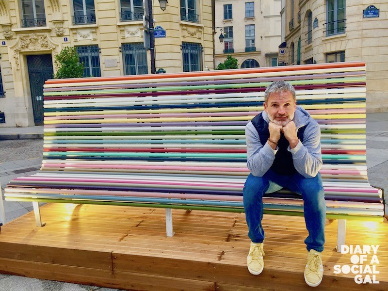
Causse is a member of the prestigious Comité français de la couleur, an association that has explored colour for 50 years in the domains of fashion, textiles, architecture, the arts, gastron- omy and design.
He has also worked with some of the biggest fashion and cosmetics brands in the world and authored the book, L’Étonnant pouvoir des couleurs (The Astonishing Power of Colours), which chronicles the influence of colour everywhere, from our bedrooms to the worlds of campaigning and politics.
LIGHT FIRST
Surprisingly though, colour is not the first thing Causse notices when entering a space like a restaurant or hotel. “I first notice light,” he says, elaborating that “there is no beautiful colour without light.”
COLOUR US HAPPY
Of course, his immediate next recommendation for good space-making is you guessed it — colour — highlighting the difference it makes in elevating the spirit and setting a mood for a space. “After lighting, colours are essential to making a space friendly and inviting,” he said.
He explains that red is especially impactful. “A restaurant looks more cordial if there is red and red whets the appetite.” And when it comes to clothing, he notes: “the more studies I read and conduct on colours, the more I tell myself it is important to wear some. I now often wear pink tee-shirts and notice that the people I cross paths with, smile more.”
To further drive home the mood-lifting impact of colour, Causse points to certain darker spots on the map like France and Japan where, against a backdrop of less vibrancy, citizens suffer from more of the blues and consume more anxiolytics than other brighter destinations like India (where colour is everywhere and sacred), Cinque Terre in Italy, and even our very own Montreal, where colour is used to greater advantage. (Causse lived in our ville for one year, decades ago, and had praise for the local street artists a few years back upon a visit, when noting that they’d taken on Duluth’s grey walls, converting them into inspiring urban canvasses.)
Perhaps, however, his most convincing geographic-based argument for the transformative power of colour are the promising results being documented in places like the Vila Cruzeiro favela in Rio de Janeiro and South Africa’s Bo-Kaap, where a decrease in crime was tracked after colour was introduced and applied to beautify various infrastructures.
Notably, the results have inspired a similar Paris-based initiative that Causse has embraced in certain disadvantaged suburban neighborhoods. “My wish is to bring this initiative everywhere around the world,” he said, adding that “my ultimate dream is to bring back bold colours to Haiti. It’s the Pearl of the Antilles and that involves colours!”
PARTING THOUGHTS
So we may not have completely demystified all elements of space-making … but we’re certainly off to a good start.
