When dining out, I look for an inspired menu, solicitous service and a wine list filled with discoveries. A rockin’ ambiance is always good, and as for location, I tend to select restaurants closest to my front door. Where does interior decor fit into that list of priorities? Usually, low down.
However, when I really reflect on some of my favourite meals, the surroundings play a larger role than I had remembered. It is said we eat with our eyes and then our stomachs, but the restaurant’s design sets the tone before the menus even hit the table. Case in point: I recently dined at a cool Parisian restaurant called Abri where the food was terrific but the design was nonexistent. My memories of that night pertain solely to a series of dishes that really could have been served any- where. As great as it was, I’m sure the evening would have been that much more memorable had the design been even a tad soigné. At another meal in France, this time at the renowned brasserie, La Cigale, in Nantes, the old-school surroundings were absolutely spectacular, but the food was utterly forgettable. While I would recommend Abri, since ultimately dining out is all about the food, the fact that I found the experience lacking emphasizes that the best restaurants are about the full experience. And when you experience great food in a fabulous decor, well then … score!
Here are my top picks for restaurants in Montreal that manage to score on both these fronts, places where, when you’re done admiring the plate presentations, you can turn your attention to the marvellous setting:
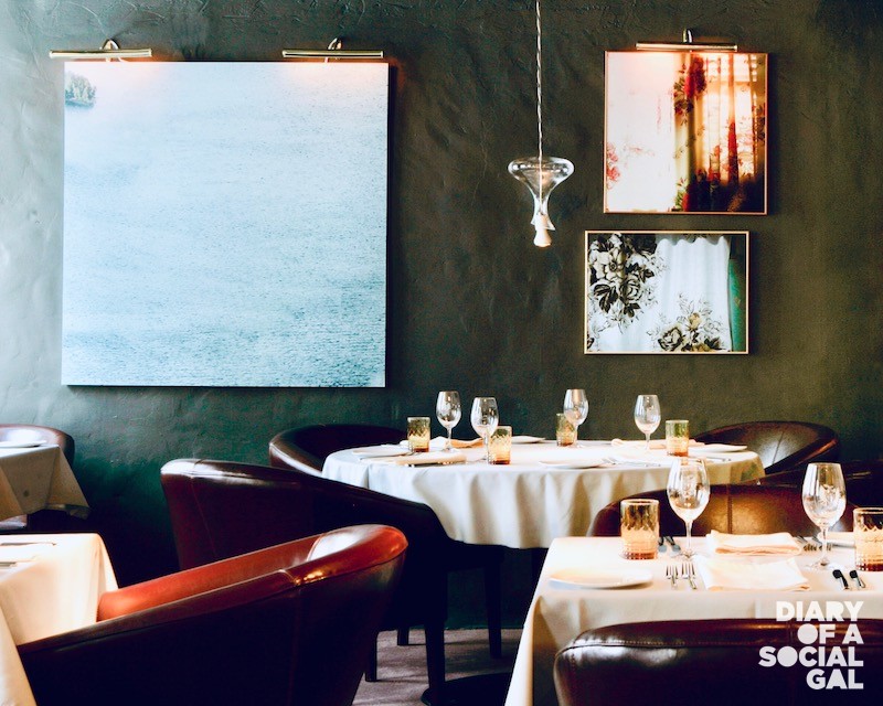
LE CLUB CHASSE ET PÊCHE
With a design created by Bruno Braën of Cabinet Braun-Braën, this truly unique Montreal restaurant (known simply as “Le Club” to regulars) features a cave-like entranceway that leads to a bar room on the left and a main dining room on the right. The colour scheme is dark and moody with tones of black, brown and grey, creating a mysterious, low-ceilinged setting. Leather club chairs and bright white tablecloths add to the overall effect, with the mustard yellow water tumblers at each place-setting providing rare hits of colour. The design is the perfect melding of old-meets-new, with the thick stone walls on the street-side of the dining room juxtaposed with large mirrors adorned with cool tableaus by visual artist Nicolas Baier.
WHAT TO LOOK FOR WHEN ON SITE:
Check out the brilliant lighting scheme that includes spotlights above every place setting, chandeliers made of inverted wine carafes, and small table lamps adorning the service tables.
MOLESKINE
Another creation by Cabinet Braun-Braën, Moleskine is a two-in-one eatery with a casual pizzeria downstairs and a fine-dining Italian restaurant upstairs. The street-level space features a large open kitchen outfitted with a wood-burning oven from which delicious pizzas emerge. The seating is counter-style and in summer the widows are opened wide, creating a breezy space for diners up for a little people-watching with their gelato. The upstairs room is groovy chic, with seventies-style rattan-backed chairs, a grey-fabric-covered wall and a glass barrier from which diners can watch the action below while admiring the beautiful stained glass window from the original building.
WHAT TO LOOK FOR WHEN ON SITE
Check out some of Braën’s kooky touches like pens hanging from the ceiling on telephone cords and the mix of surfaces and textures used throughout the design while enjoying the funky background tunes spun on vinyl by the kitchen staff beside the pizza oven.
MONARQUE
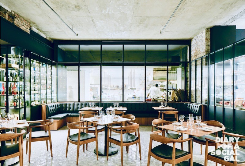
Opened in the summer of 2018, Monarque has set a new standard for elegance on the Montreal restaurant scene. I would even go so far as to say that design-wise, it’s one of the city’s most impressive — surprising as its last incarnation was a furniture store. The building dates to 1845 when it housed the Ottawa Hotel, before a fifth floor was added. The space is grand, spanning the block between Saint- Jacques and Notre-Dame just around the corner from Victoria Square, the epicenter of Montreal’s business elite. The firm of Alain Carle Architecte worked their magic at creating a 175-seat restaurant set over three rooms, beginning with a magnificent bar with both bar and banquette seating near the entranceway. The second space is a go-between, serving a brasserie menu, ideal for families since children can’t be served up front. The section in the back serves as a glamorous dining room highlighted with swish curved banquettes. Adding to the stylishness of it all is the charcoal-black colour scheme, with celery green chairs, wooden table tops, and Simon Johns light fixtures brightening up the scene. The exposed brick and stone walls are a nod to the building’s long history, while a wall of wine bottles lined up in boxes over the bar give it a contemporary feel. But the real star of this show is the 4,000 square-foot sparkling marble-tiled floor, which adds an art deco accent to the overall design.
WHAT TO LOOK FOR WHEN ON SITE
The focal point of this room is the fishbowl window looking into the stainless-steel-outfitted kitchen. Another great feature is the sleek back-lit cabinets in the centre of the restaurant where vegetables and bread are displayed.
MONTREAL PLAZA
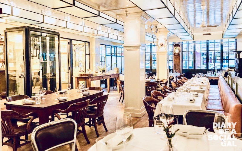
Anyone who knew this space as the former bistro L’Étoile remembers it as huge, gloomy and grim — and on top of that, a location on a commercial street that had long been written off as passé. Yet now, thanks to designer Zébulon Perron, Montreal Plaza has one of the most exciting dining rooms you’ll ever visit. The walls and high ceilings are white-painted beadboard, tables come in all sizes, and silver-rimmed, frosted-glass fixtures run the length of the room. There are orange banquettes, a gleaming open kitchen and a bar near the entrance where party animals flock afterhours. The room is set on several levels, with little private alcoves for more intimate dining and a raised platform smack in front of the kitchen for attention-seeking celebs. Tables are bare, chairs are tavern-style, and the many personal items placed around the room (orchids, clocks, chef Charles-Antoine Crête’s teddy bear) give this 70-seat space loads of personality. Noise levels can be high, but the ambiance is electric and the crowd is seriously cool. You can’t not have a good time in this dazzling room.
WHAT TO LOOK FOR WHEN ON SITE
Two special and somewhat hidden rooms on the north side of the space include chef Crête’s office and the claymation studio where many of the restaurant’s amusing Instagram posts are created.
UN PO’DI PIÙ
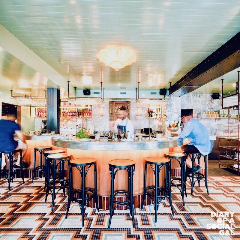
Co-owned by Dyan Solomon and Eric Girard, also behind the fab Olive & Gourmando and Foxy, Un Po’ Di Piu has much appeal, starting with its Old Port location. Set on rue de la Commune, a popular tourist strip well-known for souvenir shops and casual eateries, Un Po’ Di Piu adds a welcome shot of elegance to a street that is all too often forgotten. Once inside the restaurant/café, the wows multiply as diners admire the sophisticated European decor created by designer, Zébulon Perron. This restaurant is simply a feast for the eyes! Everywhere you look it’s sheer gorgeousness. The teal crushed-velvet banquettes, the curved zinc-topped bar, the stone walls, the swirly marble walls, and the magnificent light fixtures all make for the most sophisticated space, everything tied together with a stunning, mosaic-tiled floor. With its great location and fabulous decor, Un Po’ Di Piu is already a jaw-dropper, and the food (think antipasti, aperitivos and Italian-themed breakfasts) is just as beautiful.
WHAT TO LOOK FOR WHEN ON SITE
The lamps! From the magnificent fixture in the entranceway to the smaller lamps around and behind the bar, the lighting scheme is what takes this restaurant design to the next level.
CAFÉ FERREIRA
To celebrate their twenty-year anniversary, Café Ferreira’s famous owner, Carlos Ferreira, decided to renovate, making Montreal’s top Portuguese restaurant more stylish than ever. Renovations were overseen by the architectural firm of Provencher Roy, and the decor was turned over to designers Pascale Vaillancourt and Paul William Francoeur. The signature wall of broken plates is gone, alas, but in its space is a stunning mural, the main focal point of the elegant grey and black colour scheme. It’s all quite sleek and chic, and as much as I loved the Mediterranean blue and sunflower yellow original colour scheme, the new look provides a breath of fresh air without a radical departure from the restaurant’s origins.
WHAT TO LOOK FOR WHEN ON SITE
The mezzanine, formerly the location of the least popular tables in the restaurant, has been redesigned offering a great view in to the adjacent glassed-in kitchen, now making it one of the best spots in the house!
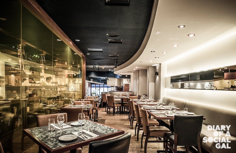
LEMÉAC
Another fabulous space conceived by the late, great architect Luc Laporte, Leméac’s dining room features arched windows facing Laurier Ave., allowing copious amounts of sunlight to permeate the wine-coloured, wood-panelled, stone-floored room by day, and create the illusion of a chic fishbowl at night. In summer, the left side of the restaurant is the place to be, as their famous covered terrasse draws fashionable, rosé-sipping diners with no risk of inclement weather conditions even on the rainiest of days. Leméac is also a grand restaurant, and in a city crowded with small bistros and trattorias, such a sweeping space is more than welcome. Leméac’s handsome bar is a popular spot for single diners and draws a lunch crowd of city bigwigs. For an extra-private dinner or lunch, book one of the two banquettes in the back.
WHAT TO LOOK FOR WHEN ON SITE
One of my favourite design elements at Leméac is the window in the entranceway filled with wine bottles where you can have a look at the great selection on offer before ordering.
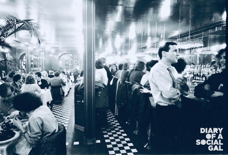
L’EXPRESS
A Montreal landmark since 1979, L’Express remains one of the most stunning and talked-about restaurants in the city. What’s the secret of its success? The crackling Left Bank ambiance, coupled with a comfortable, timeworn noblesse to a place where beauty meets function in all the details: the zinc bar, the black and white checkered floor, the papered tables with jars of cornichons and sliced baguette on every one. L’Express may meet most everyone’s bistro fantasy, but the decor, conceived by the late, great architect Luc Laporte, is far from film-set perfect. Unlike many modern bistros that feel like they were dreamed up by a set designer, L’Express feels utterly authentic. When dining with a group, I prefer sitting centre-stage, between the sunny yellow, glass-ceilinged room at the back and the glossy brown-mirrored walls up front. But for a tête-a-tête, patrons willingly can turn their backs to the crowd for a more intimate evening at the bar, where legendary barman Monsieur Massonholds court among rows of gleaming glasses and an impressive selection of digestifs. Even the red-rimmed menus are stylish at L’Express.
WHAT TO LOOK FOR WHEN ON SITE
The best table in this bistro is not at the bar, or along the side of the room, but under the potted palm smack in the middle.
TOQUÉ
When Toqué! moved from its famous Plateau location to swish new premises on the ground floor of the Caisse de dépôt et placement building in Old Montreal back in 2004, it more or less became a new restaurant, which just goes to show the effect design has on a restaurant. Today’s look features high ceilings framed by tall windows draped in billowing white and orange curtains with a colour scheme of magenta, red, brown and green. The widely-spaced tables give the room a more formal feel than in most of our city’s top restaurants, placing it on par with the world’s top luxury establishments. Glancing around the multilevel room, you’ll see a towering glassed-in wine cellar, and a new bar seating space for those up for a more relaxed evening. Designed by Jean-Pierre Viau, who is responsible for many of the city’s most extravagant restaurant decors, Toqué!’s room was recently reduced in size to make the space feel more intimate, which has given new life to this now 25-year-old establishment.
WHAT TO LOOK FOR WHEN ON SITE
Lucky diners who have the chance to tour behind- the-scenes will be amazed by the size, beauty and spotlessness of chef Normand Laprise’s gleaming kitchen, which is a design element all its own. Ask for a tour!
SSENSE CAFÉ
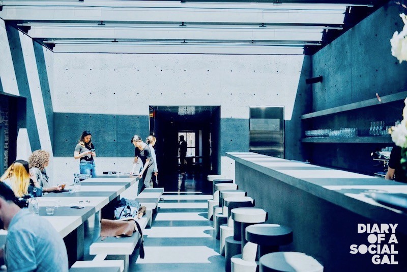
Located in the heart of Old Montreal on the fifth floor of the Ssense flagship, SSENSE Montreal, this new café has garnered plenty of buzz since opening in May 2018 thanks to its edgy design and talented operators. The look is all modern art, concrete and steel, fronted by the original 1866 façade. There is a slight bunker-like feel to Ssense Café, which was designed by London-based David Chipperfield Architects (responsible for the entire store actually), yet the dark cement-framed space is gawk-inducing, with seating for 34 at the bar as well as a central communal concrete table. I visited on a hot summer day and loved the way the sun shone through the striped windows in the ceiling. It’s all rather captivating.
WHAT TO LOOK FOR WHEN ON SITE
The way the shadows change the look of the room throughout the day, transforming the lighting and mood of the room entirely.
BRASSERIE HENRI
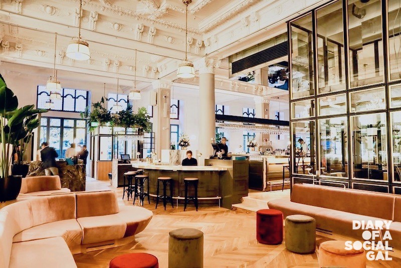
Downtown Montreal’s Birks headquarters building was built in 1894 and designed by Montreal architect Edward Maxwell, complete with ornate interiors and stained glass windows. In the summer of 2016, the building was sold to the owner of Laval’s Hotel Le St-Martin, Jean Salette, who invested $70 million in renovations to transform it into a swish, 120-room boutique Hotel Birks whose restaurant, Henri Brasserie Française, takes up part the main floor facing Phillip’s Square (the other half remains the Birks store). Designer Zébulon Perron was brought in to rejuvenate the space along with Salette, and the results are reminiscent of classic French brasseries with a definite Quebecois influence. With high ceilings, intricate mouldings, peacock blue banquettes, brass railings, a zinc-topped bar and potted palms, it’s seriously showstopping — très old-world European. It’s also quite formal with white tablecloths, herringbone wood floors, pillars, chandeliers and seafood displayed on silver platters around the bar. The true luxury that this restaurant offers is space, though, which means it’s not noisy and no one will eavesdrop on your conversation. And yet you don’t feel isolated, as the tables are close enough for some excellent people-watching.
WHAT TO LOOK FOR WHEN ON SITE
Look up, way up when in Brasserie Henri, specifically at the mouldings on the ceiling that were entirely rebuilt during the renovations by artisans using plaster casts for nearly six months. The results are nothing short of magnificent!
MAISON BOULUD
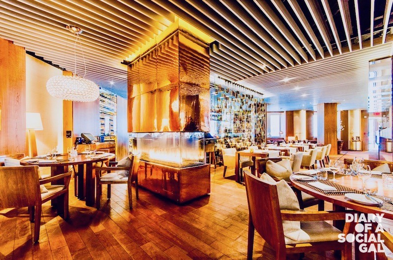
One of Montreal’s rare luxury restaurants, situated in the snazzy Ritz-Carlton Montreal, Maison Boulud feels plush and sophisticated but also approachable. The design was overseen by the Japanese firm, Super Potato, but much of the furnishings were manufactured in Quebec. The space is divided into different sections framed by pale glass panels with a glassed-in gas fireplace between the bar and the dining area. The semi-open kitchen is surrounded by a band of frosted glass, but when you look up you’ll see the cooks in action. Overall the room has a rather corporate feel, until you get to the spectacular terrasse, which is right out a Merchant-Ivory film — especially when the garden is in full swing mid-summer.
WHAT TO LOOK FOR WHEN ON SITE
The whimsical chandeliers made from wine glasses suspended upside down in the private dining room on the west side of the restaurant. And in summer, the ducks, of course.
ROSÉLYS AT THE FAIRMONT
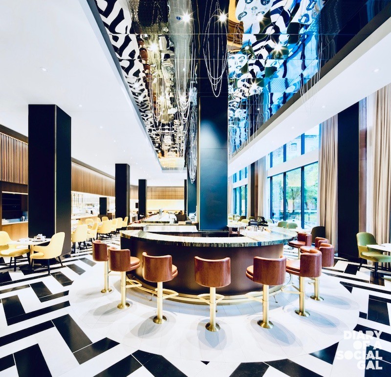
Those who recall the renowned Beaver Club restaurant in this iconic hotel will hardly recognize their new dining space since their $140-million mega makeover. The whole project was re-imagined by Sid Lee Architecture in 2017, and the new restaurant, Rosélys, located on the west side of the hotel, is simply outstanding. With towering ceilings and a U-shaped central bar adorned with boxes of fresh oysters, it’s all very Great Gatsby, especially with the jazzy black-and-white tiled floor and sounds of cocktail shakers tinkling in the background. The back of the room is framed with Dijon-yellow banquettes, and there are not one but two open kitchens where you can watch cooks busily cooking and wiping plate rims. Truly one of Montreal’s most spectacular dining rooms, Rosélys is also the ideal setting for weekend brunch.
WHAT TO LOOK FOR WHEN ON SITE
Don’t miss the Artisans Market adjacent to the dining room, which sells everything from flowers to live lobsters to chocolates, as well as ready-made meals including rotisserie chicken, sushi or pizza. There’s also a large selection of gourmet products, both local and imported.
LE RICHMOND
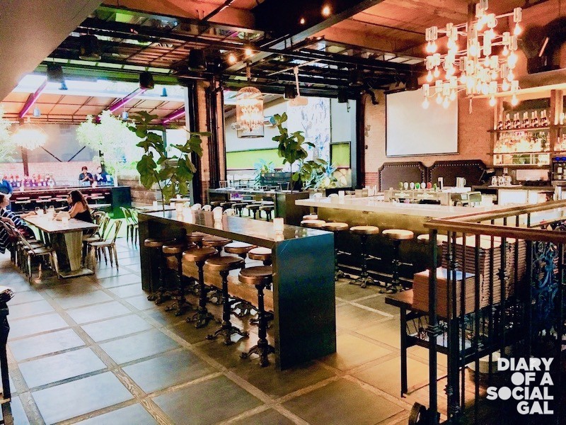
Set over two levels with an action-packed bar as the focal point, Le Richmond’s locale has been designed as a sort of mega dining room. The seating options are either très cool industrial-style furniture or, for the true divas, magenta-coloured thrones. There’s also a terrasse that creates quite a spectacular scene once the glass garage doors are thrown open in summer when the retractable roof is put to good use. The overall sensation of this dramatic space created by designer and owner Luc Laroche is part mega loft part theatre set over a 3,200 square foot converted space that, when filled, seats well over 200. As for the look, there’s a cool mix of industrial architecture and contemporary design, accented with modern finishes and antiques that date back to 1886, the year the edifice was erected, resulting in a thoroughly modern restaurant proud to highlight its 19th-century origins.
WHAT TO LOOK FOR WHEN ON SITE
Do not miss out on terrasse dining here as Le Richmond boasts one of the most stunning experiences in Montreal, complete with potted trees, containers of fresh herbs and wrought iron furnishings. Gorg!
For more Lesley, follow her on social media @Lesleychestrman.
